
My name is Dina.
I make graphic solutions.
Have a look at what I do best.

Have a look at what I do best.
Shapes, colors, fonts and photos - layouting these is primaraly what graphic design consist of and I am ready to deliver many types of projects within this wide spectrum.
It is an art in itself to make texts legible, beautiful and get the important info across fast, all at the same time. Fortunately I think it is quite fun to make all this add up.
If a picture is worth a thousand words, a good illustration says it a lot more directly. I can create tight lined info graphics and icons or more nuanced illustrations.
I can adjust photos to make sure it has the right properties for the medium it will be used on. I can also manipulate photos in case the original was not perfect.
User friendly and intuitive design is in focus when I make responsive web solutions. I can work with HTML, CSS and CMS - so I can handle both the design and front-end development of your page.
I am at home with the print process - both limitations and possibilities. I can deliver large as well as small print jobs and I will gladly be in contact with the printing house so all communication is clear.
Need a new identity or polishing an already existing brand? I can help with defining the brands uniqueness. I also make design guides so the brand can stand strong in the future.
Especially with the purpose of being used in a graphic context. This is neat when the photo need to be used with overlaying elements - and also allows for the use of original photos in projects.
Visual Identity - Illustrations - Packaging Design
 Show me
moreHide
Show me
moreHide
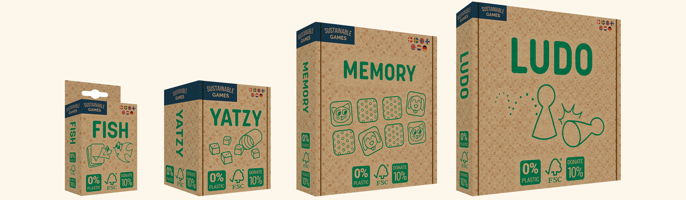
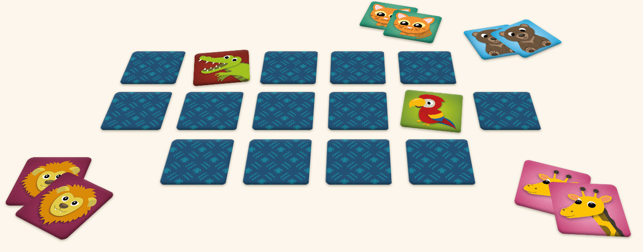
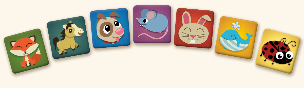
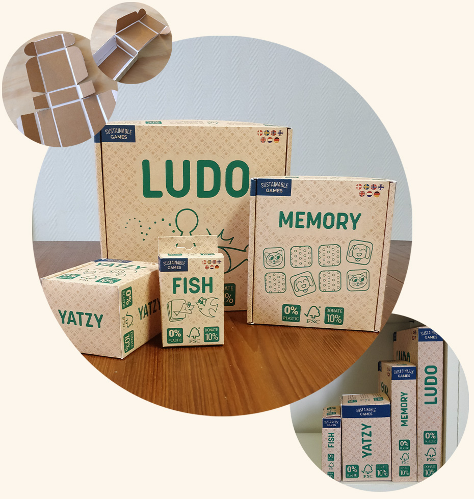
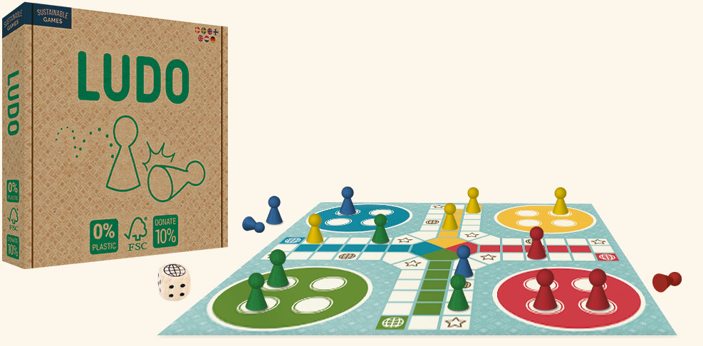
Sidekick Games had a wish to launch a new brand of sustainable boardgames with the name 'Sustainable Games'. For this project I was involved in the whole process from the beginning of the design process of the brand, packaging design, production of prototypes for sales meetings, Illustrations for components, presentations and other sales materials etc.
This brand is currently being put on hold in order for production of another line of games. I was working on the same process with that line. Stay tuned for more info about that as I will be exited to show more once they are available in stores.
A simple and straight to the point logo, that functions as an eye catching label on the box. It is easy to identify in stores when the games are lined up that this is one of the 'Sustainable Games'.
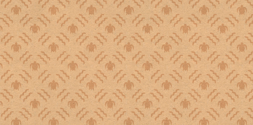
The company pattern functions as a characteristic of the brand. It works with the material on the box and underlines the idea of the brand. Living with the environment in mind.
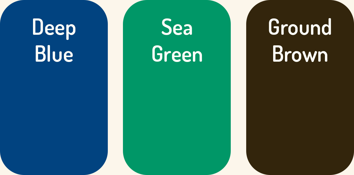
The colors are down to earth - as this is the journey of the brand. Every choice of materials and processing in these games has the environments in mind and so does the colors.
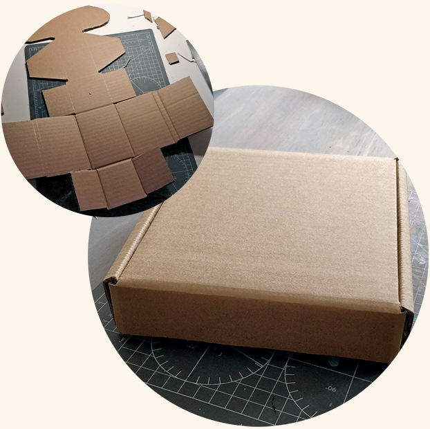
As part of this project was focused on selling the idea to possible investors it was important to show the idea with more than digital mock ups. For this I was involved in making prototypes. The solution chosen was a version made with the actual materials and a solution with the printed layout to best showcase the impression of how the finished product would look and feel.
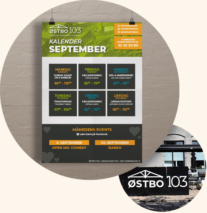
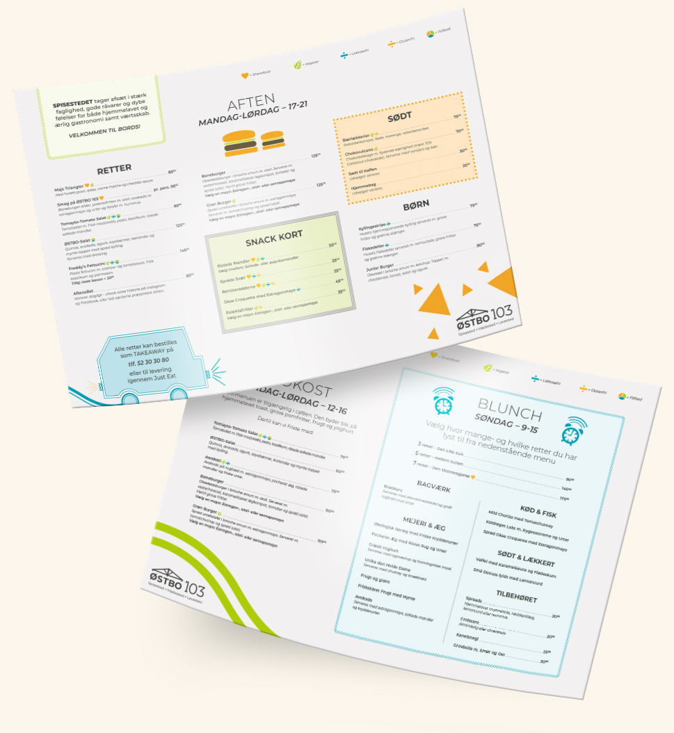
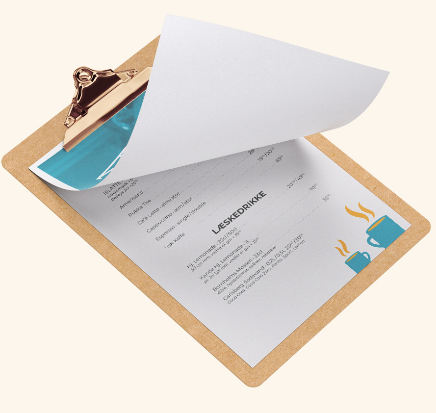
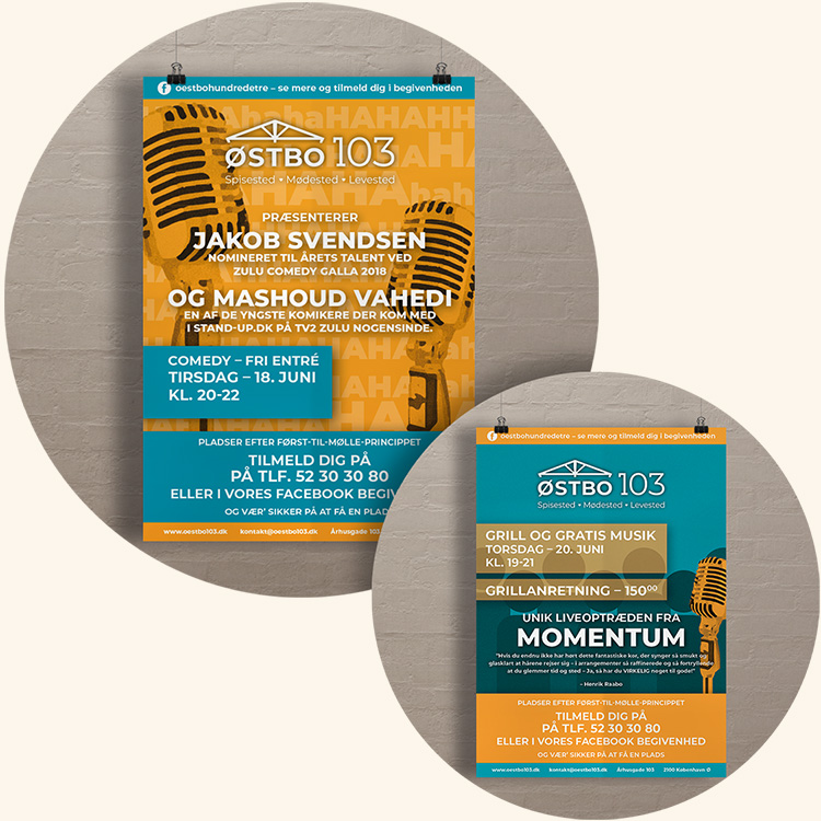
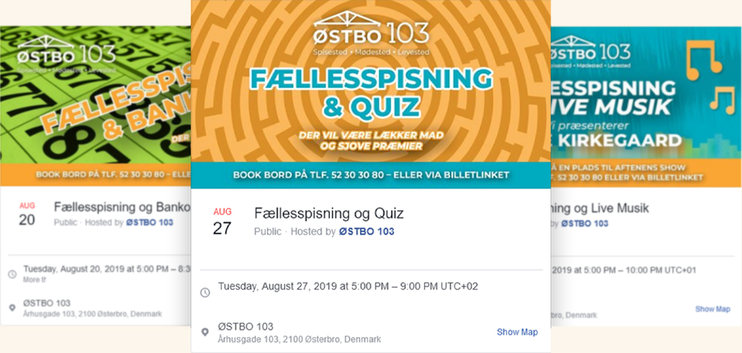
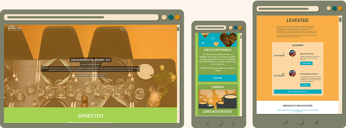
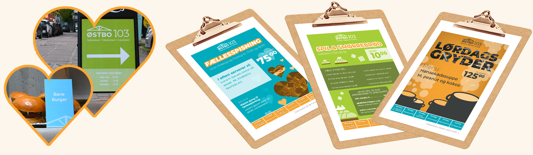
ØSTBO 103 was the result of a rebranding of a restaurant named Østerbro Madhus, located in Østerbrohuset. The new concept was to create a brand better suited for it's location and with room to contain much more than just a restaurant. ØSTBO 103 contained a restaurant in the evening, in the daytime it was a kiosk/café and also catered to the bookable meeting rooms of the house. Besides that they also often held events like bingo, standup or live music.
With this new concept I shaped the new visual identity of ØSTBO 103. The old brand had been formal and high end and I wanted to create something that suited the very lively location much better. As a municipal house the space was shared with everything from local committees and municipal elections to badminton players and kids doing ballet. Therefore I imagined a brand that was much more accessible and playful.
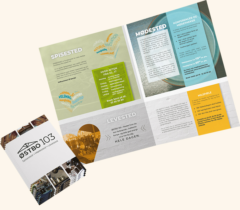
The logo was shaped after the location, with high ceilings that still shows the beams of the old tram remise it seemed natural to incorporate, so the logo could have a roof that underlined the idea of creating a 'bo' (living space).
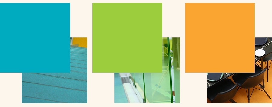
Since the location was very colorful I matched the brand to the house to get the most out of the location. The chosen colors also supported the idea of making a fun and accessible place.
Visual guidelines - Illustrations - Photo Gallery - Printed Media - Online & SoMe
 Show me
more Hide
Show me
more Hide
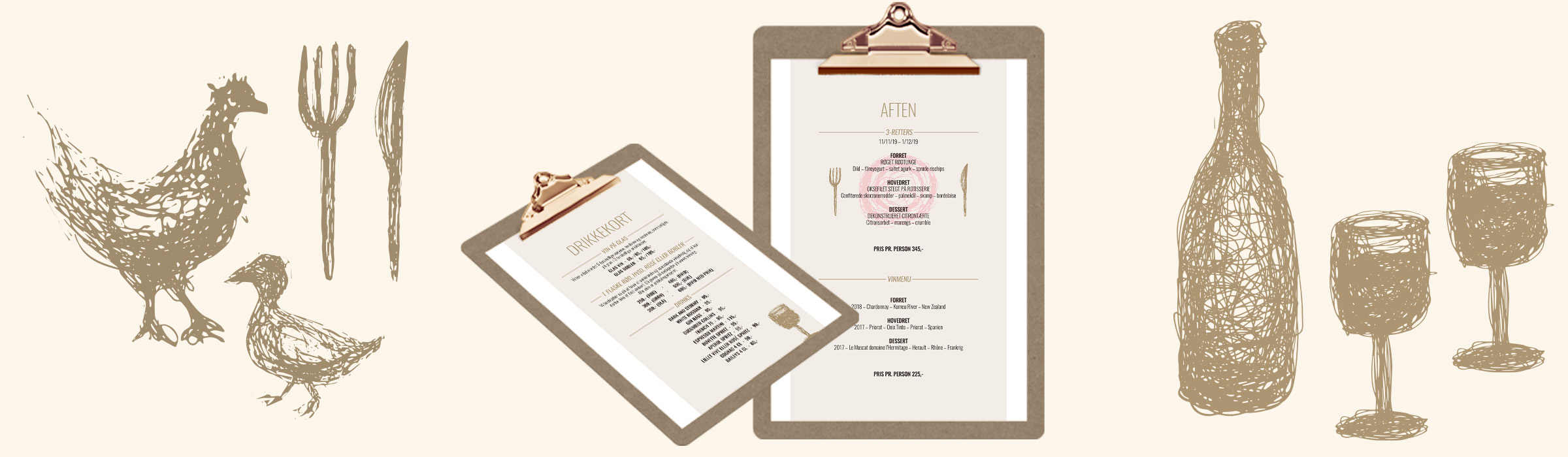
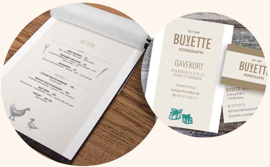
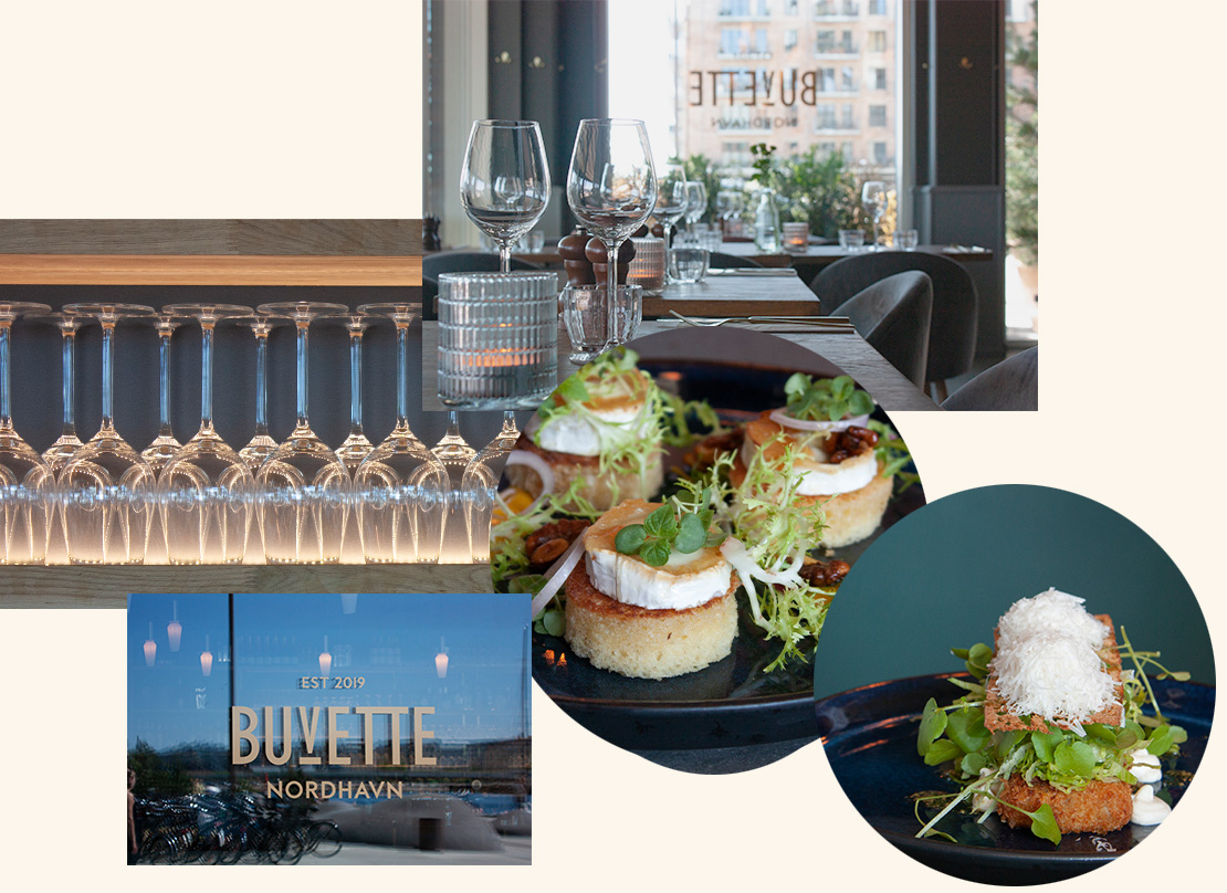
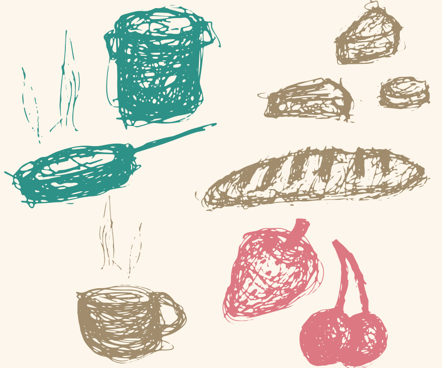
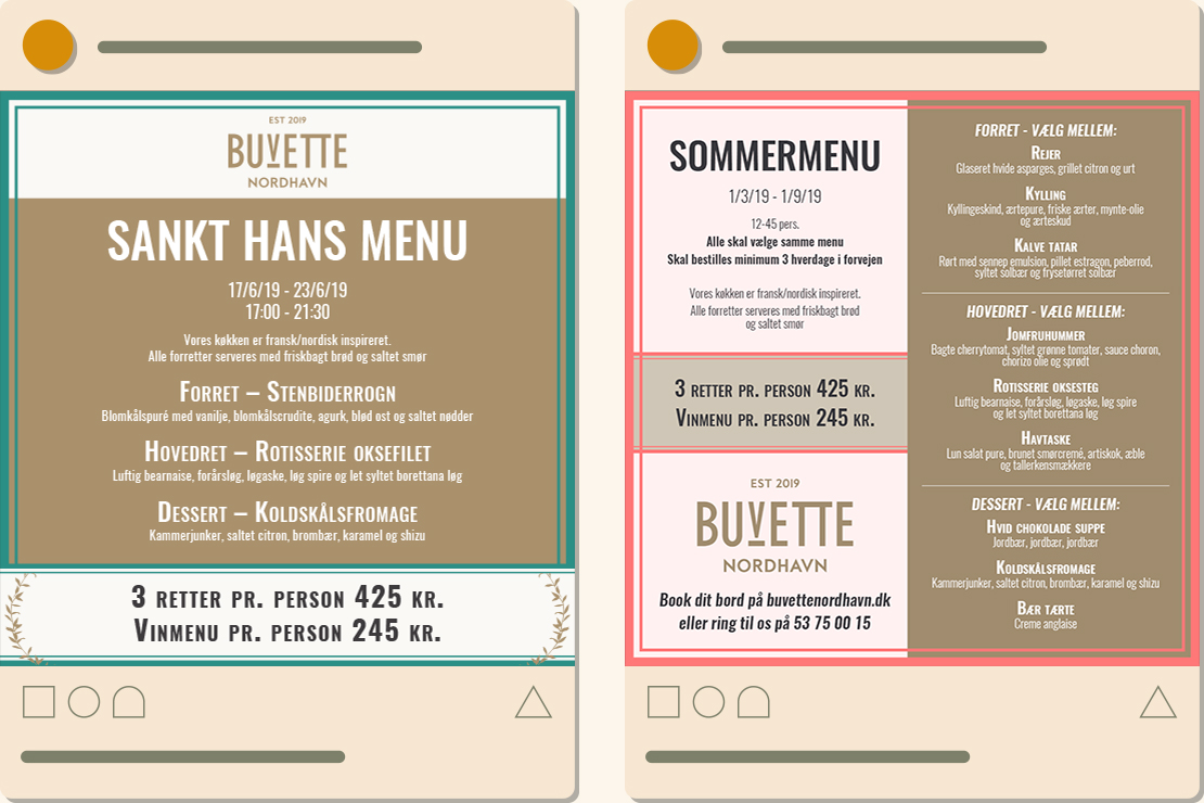
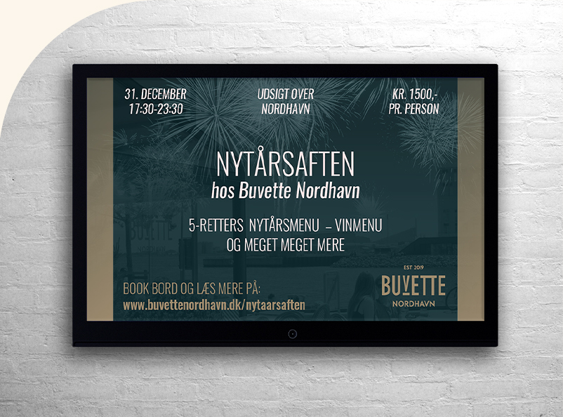
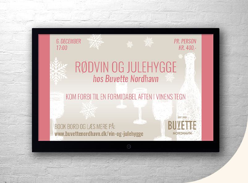
Buvette Nordhavn had a clear idea of what they wanted, so for this case I helped making guidelines to define their vision of a stylish french restaurant. For Buvette Nordhavn I made illustrations and a photo gallery so they were equipped with elements to use in marketing. I also delivered printed and digital media for a number of occasions with this new and defined identity.
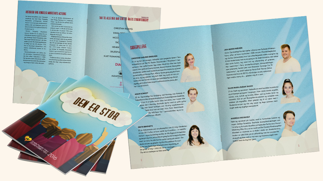
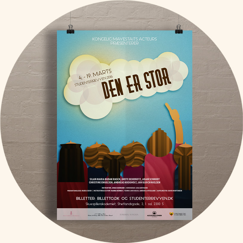
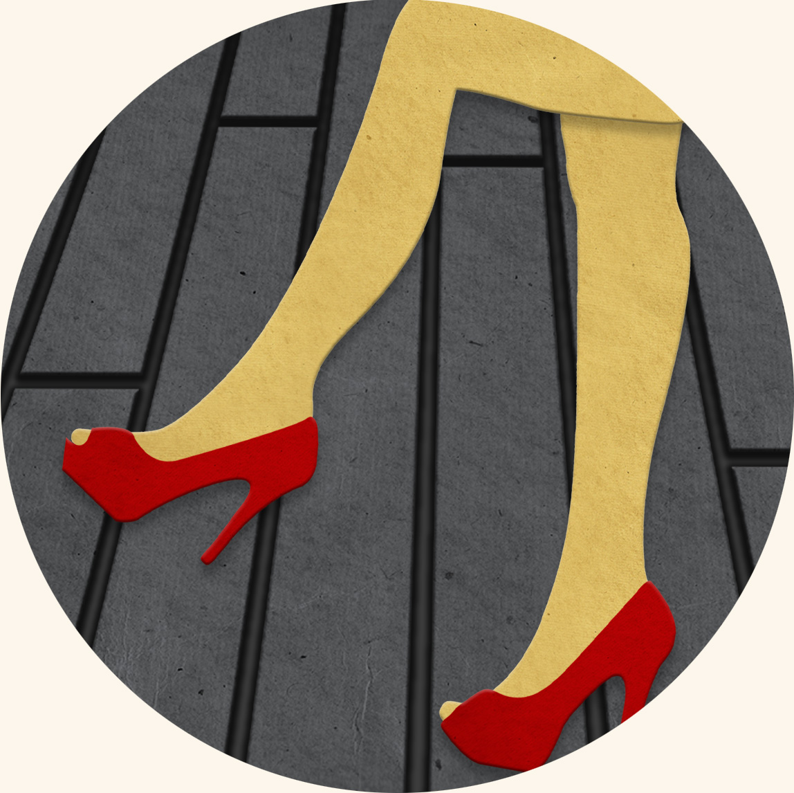
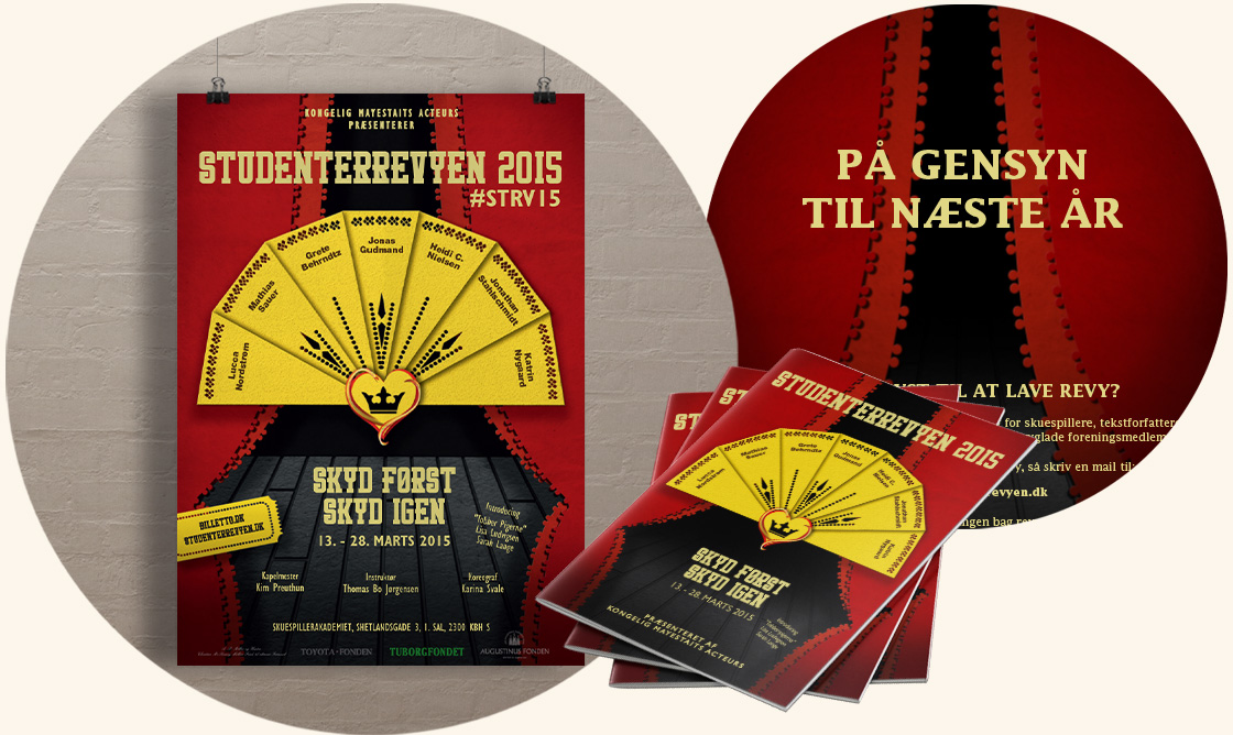
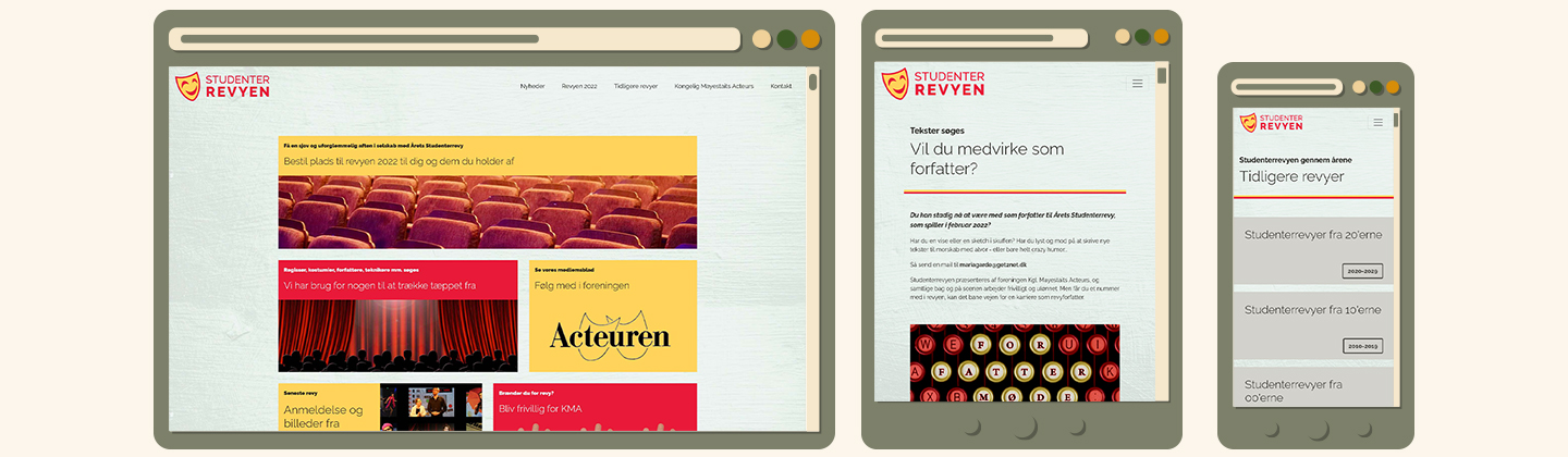
Studenterrevyeen is an annual revue held by Kongelig Meyestaits Acteurs'. There was a need for a new webpage to contain information and news about the revue and to serve as a archive for all the revues held as well as information and history about the organisation.
For this case I helped them with a new logo, designing and devloping a new website and before that I have also been involved in doing illustrations and layouts for posters and theater programs.

 Til top